OBJECTIVE
Create a modern, luxury real estate brand that feels distinctive, sophisticated, and timeless. The identity should communicate expertise, trust, and simplicity while elevating the client's presence above the competition. Every element of the brand is designed to reinforce a premium experience and create a memorable first impression.
MY ROLE
As a full-time graphic designer for a real estate company, my role is to translate each client's personality and business goals into a cohesive visual identity. Through multiple meetings, I began to develop a brand that reflects this client's vision, while differentiating her from the highly competitive real estate market. The end results form a clean, modern identity that balances elegance with approachability.
IDEATION
The client wanted a brand that felt contemporary, luxurious, and instantly recognizable within the real estate industry. During the research phase, I analyzed competitors and discovered that many agents rely on predictable symbols such as houses, keys, and rooftops.
DESIGN DEVELOPMENT
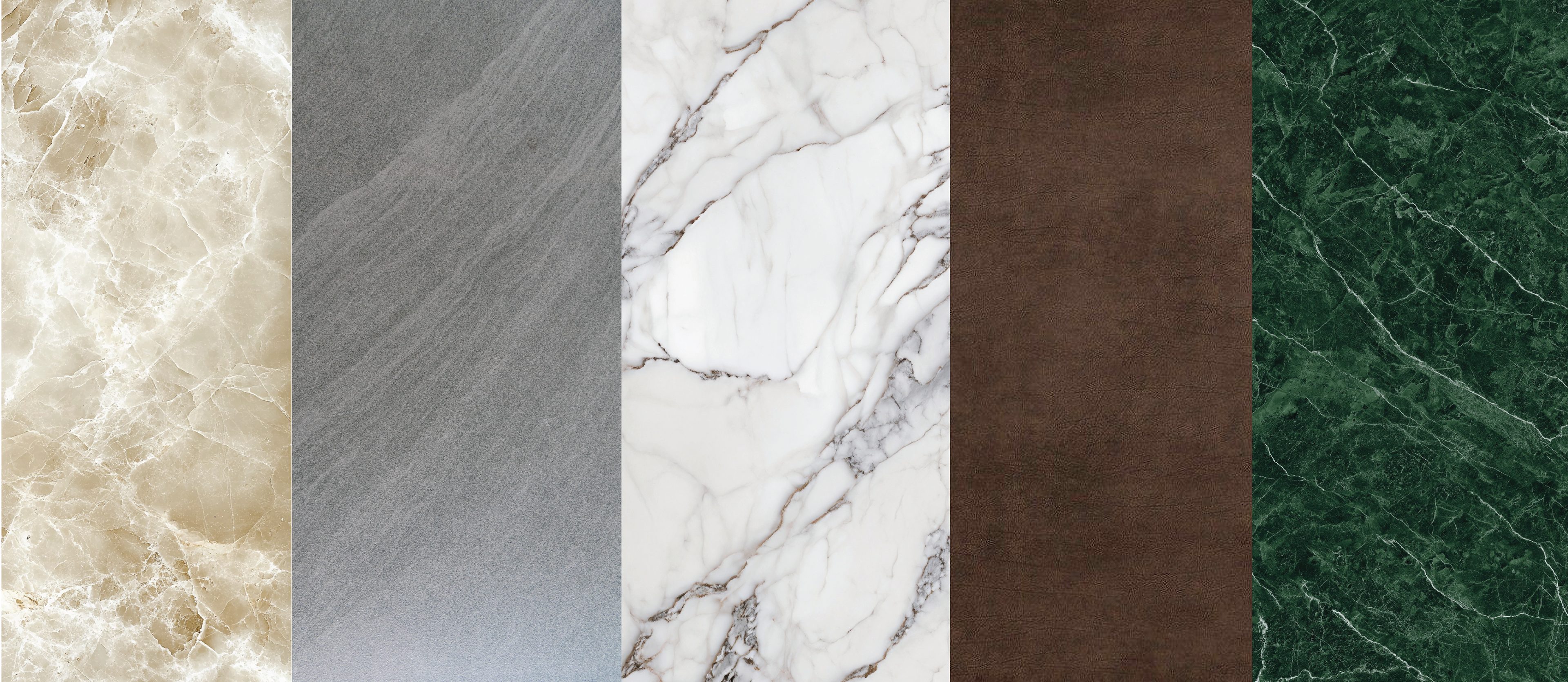
Texture is one of the defining characteristics of a home. It communicates craftsmanship, personality, and style while creating an emotional connection to a space. Inspired by this idea, I explored architectural materials commonly associated with luxury interiors.
Among the various options, marble stood out as the strongest visual representation of sophistication and quality. Its natural patterns create depth without overwhelming the design, allowing the texture itself to become a defining element of the brand.
By pairing a clean, minimal identity with the richness of marble, the final concept achieved the elevated, luxurious aesthetic the client envisioned while remaining refined and timeless.
THE FINAL LOGO
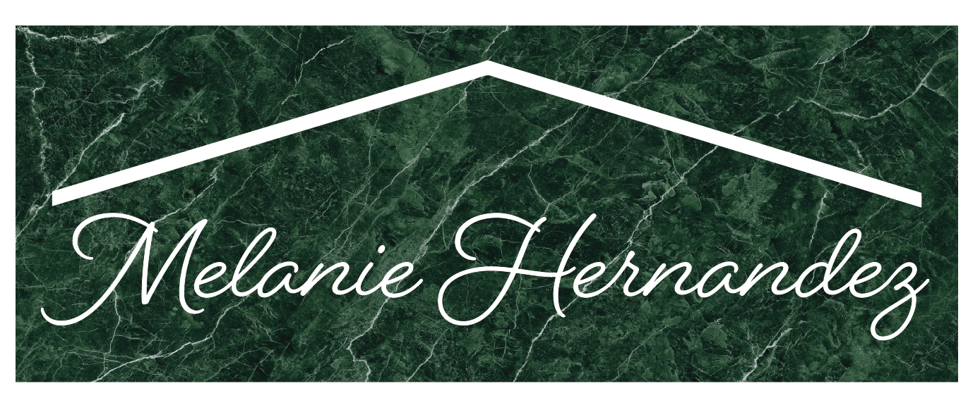
The final logo combines elegance with modern simplicity.
A custom script wordmark serves as a personal signature, creating a sense of authenticity, trust, and permanence. Positioned above the signature is a clean, contemporary rooftop element that subtly reinforces the real estate industry without relying on overused visual clichés.
A rich green marble texture completes the identity, adding depth and luxury while symbolizing quality, stability, and refinement. Together, these elements communicate a premium real estate experience that is both welcoming and memorable.
LOGO VARIATIONS
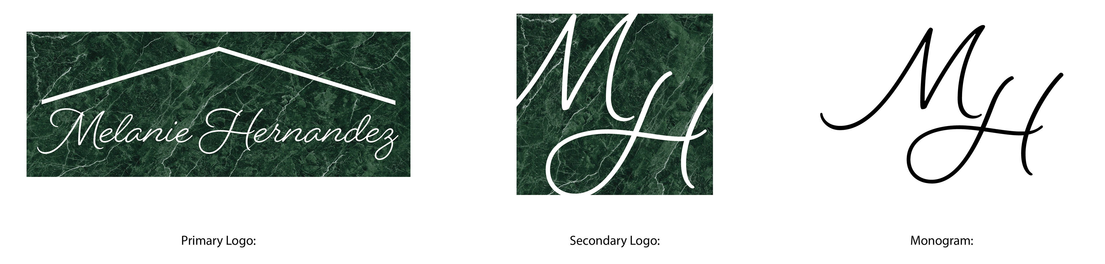
To ensure versatility across print and digital applications, I developed multiple logo variations while maintaining the luxury aesthetic.
The primary logo serves as the main identity, while alternate versions provide flexibility for different layouts, branding materials, and marketing applications. These variations ensure the brand remains consistent and recognizable regardless of where it appears.
LETTERMARK
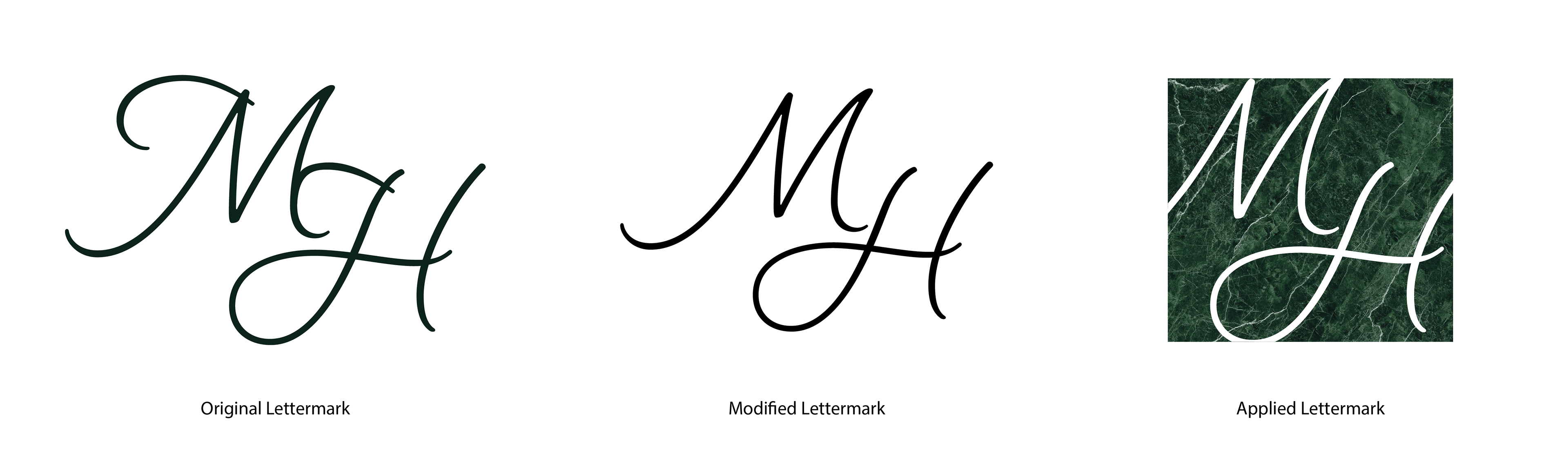
The lettermark distills the brand into its most recognizable form. Using the client's initials, the design emphasizes clean curves and balanced proportions to create a refined, memorable mark.
Its simplicity allows it to perform effectively across small-scale applications such as social media profiles, signage, promotional materials, and branded merchandise while maintaining the sophisticated character of the full identity.
COLOR PALETTE & TYPOGRAPHY
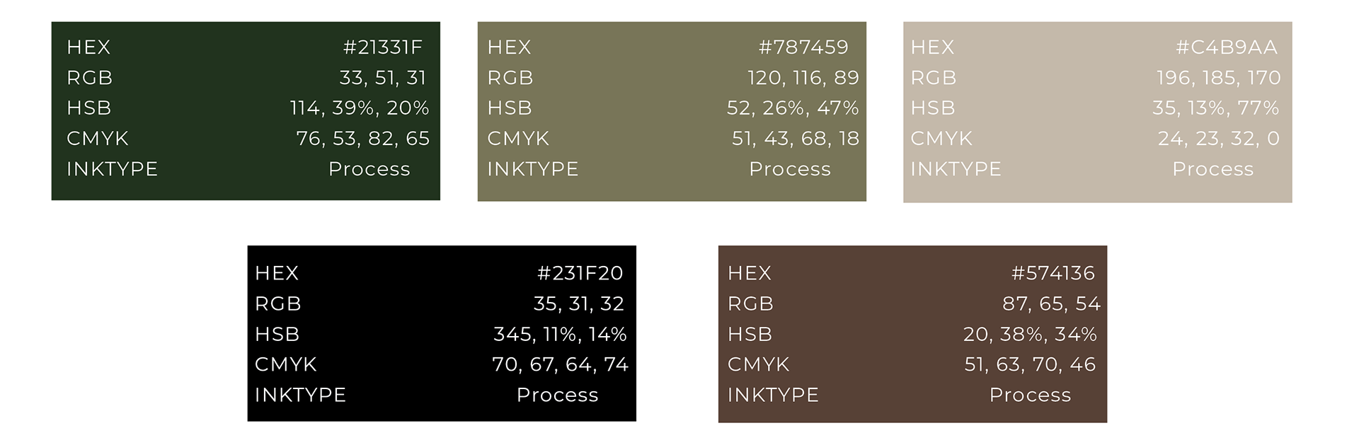
The brand's color palette was selected to evoke warmth, authenticity, and luxury.
Rich greens convey trust, growth, and a sense of confidence, while warm tans and earthy browns introduce comfort, sophistication, and a natural elegance. Together, these colors create a welcoming visual experience that reflects both the client's personality and the premium level of service she provides.
The typography complements the palette with a balance of modern refinement and timeless elegance. The flowing script adds personality and a signature feel, while clean supporting typefaces provide clarity, professionalism, and versatility across all brand applications.

MARKETING MATERIALS
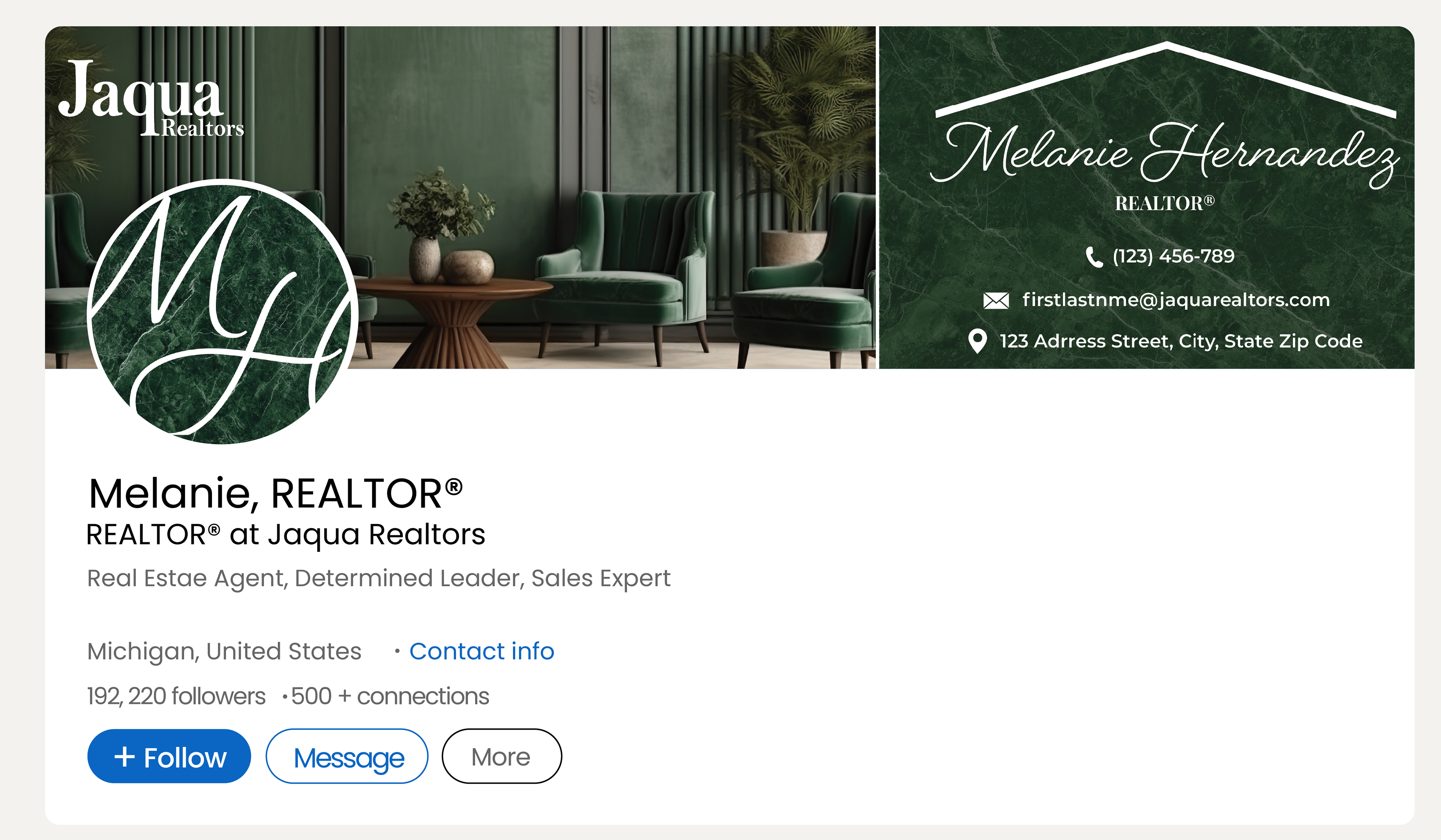
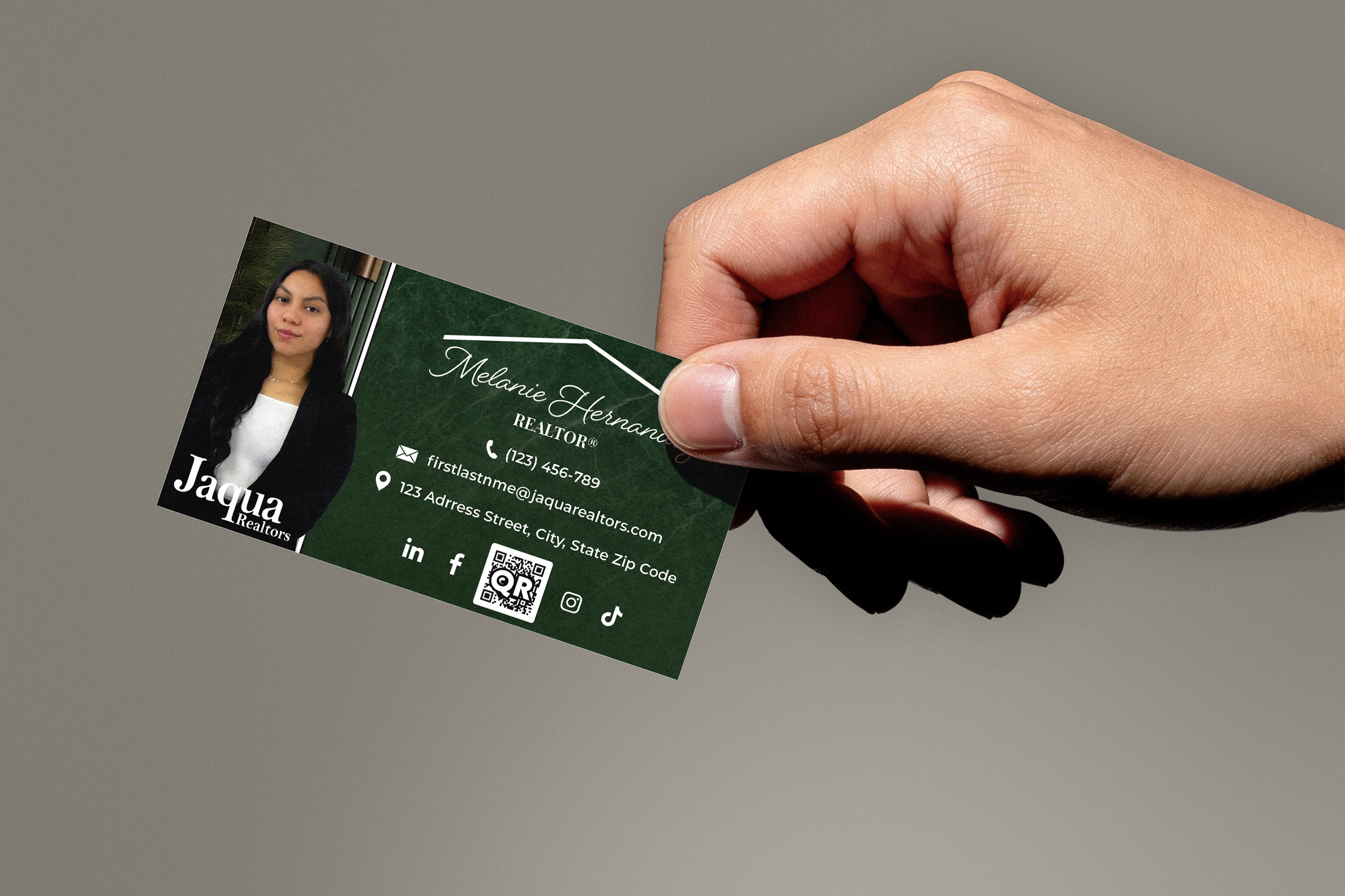
A cohesive marketing presence is essential for building recognition and trust in the real estate industry. To support the client's new brand identity, I designed a suite of marketing materials, including business cards, cohesive social media banners, and branded client feedback forms.
Each piece was developed with consistency in mind, reinforcing the visual identity across every customer touchpoint. By extending the branding beyond the logo, these materials create a polished, professional experience that strengthens brand recognition and communicates credibility at every stage of the client journey.
A home resume designed for the agent to show to potential clients.
SOCIAL MEDIA
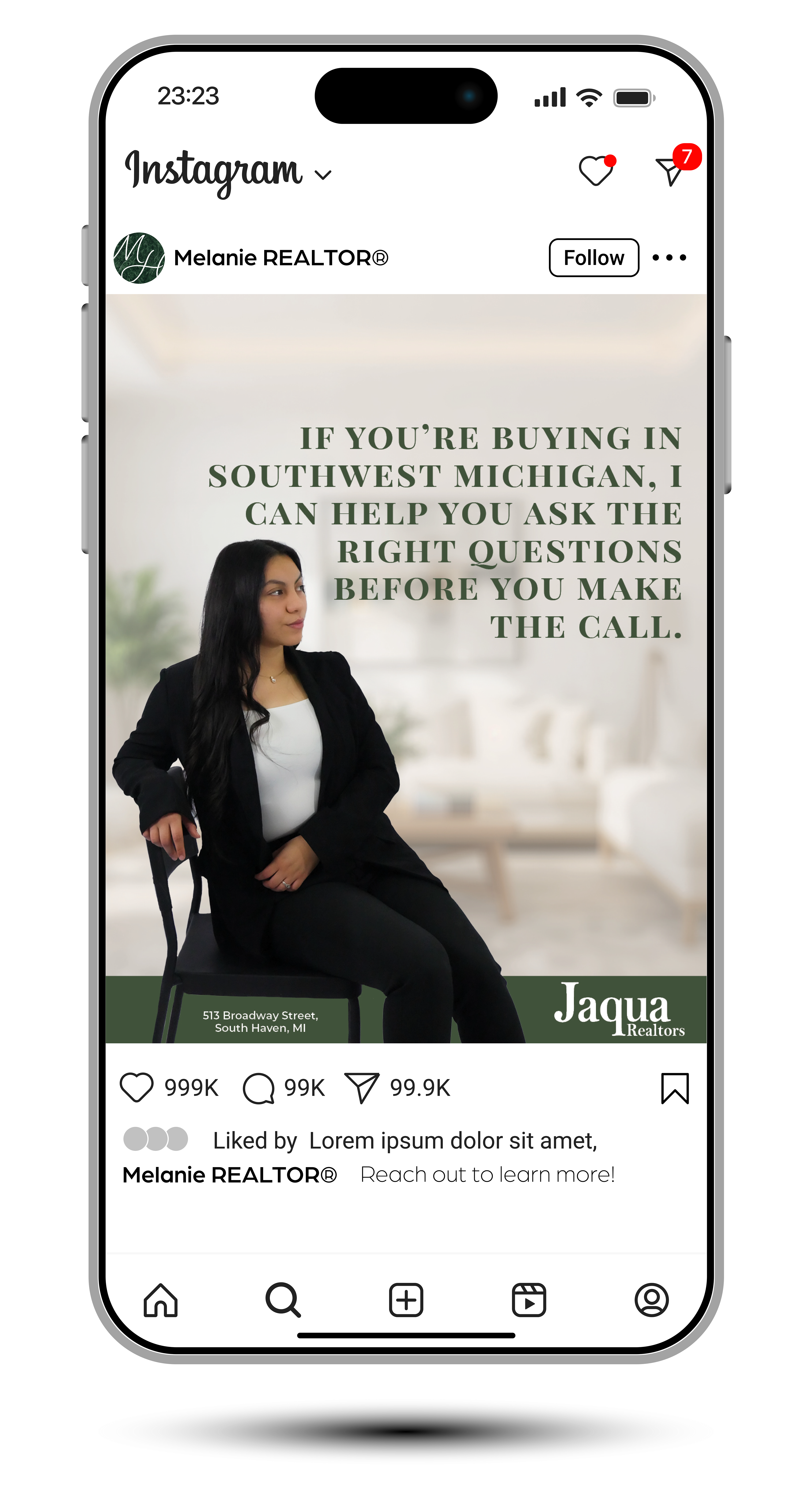
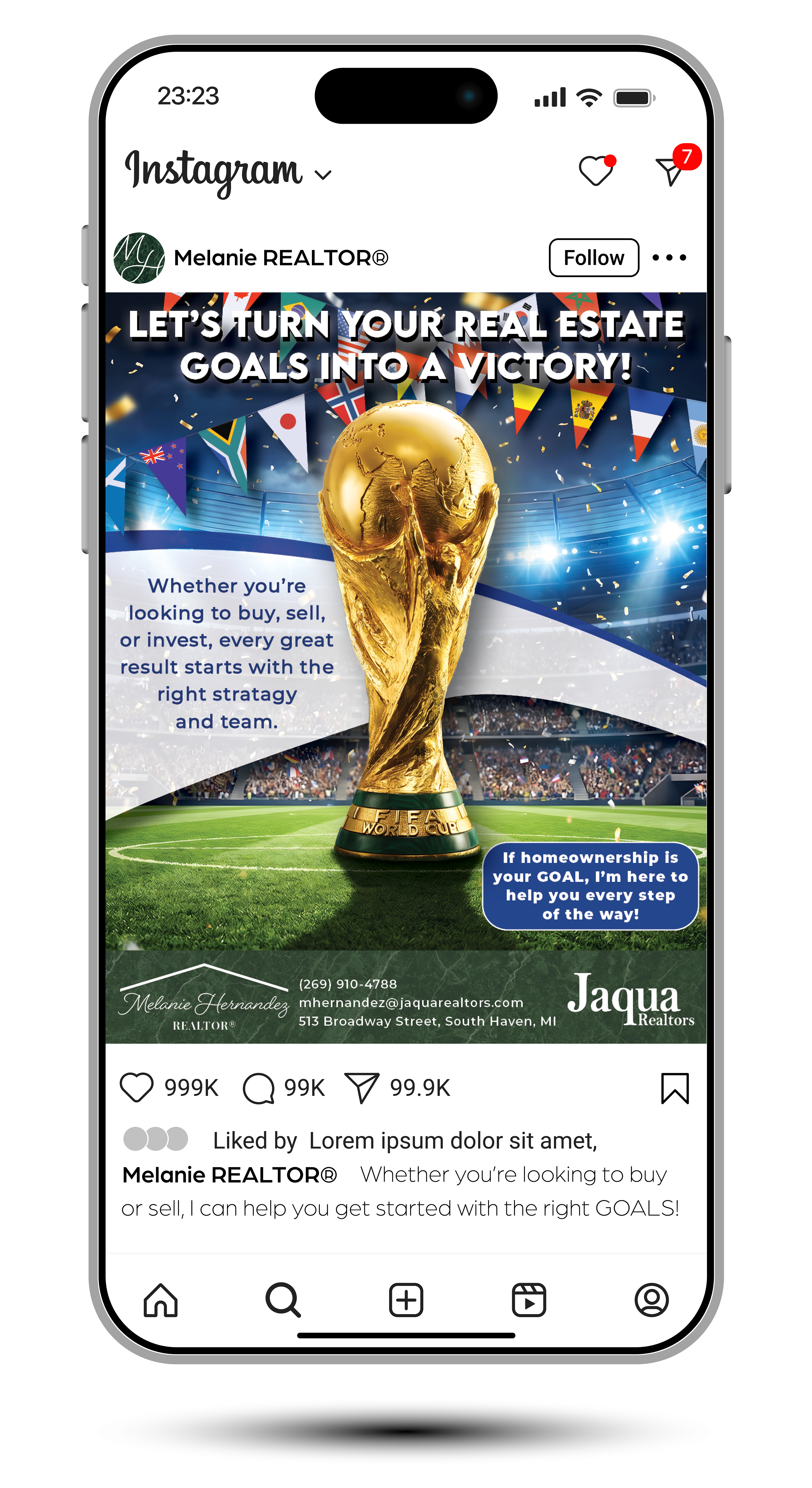
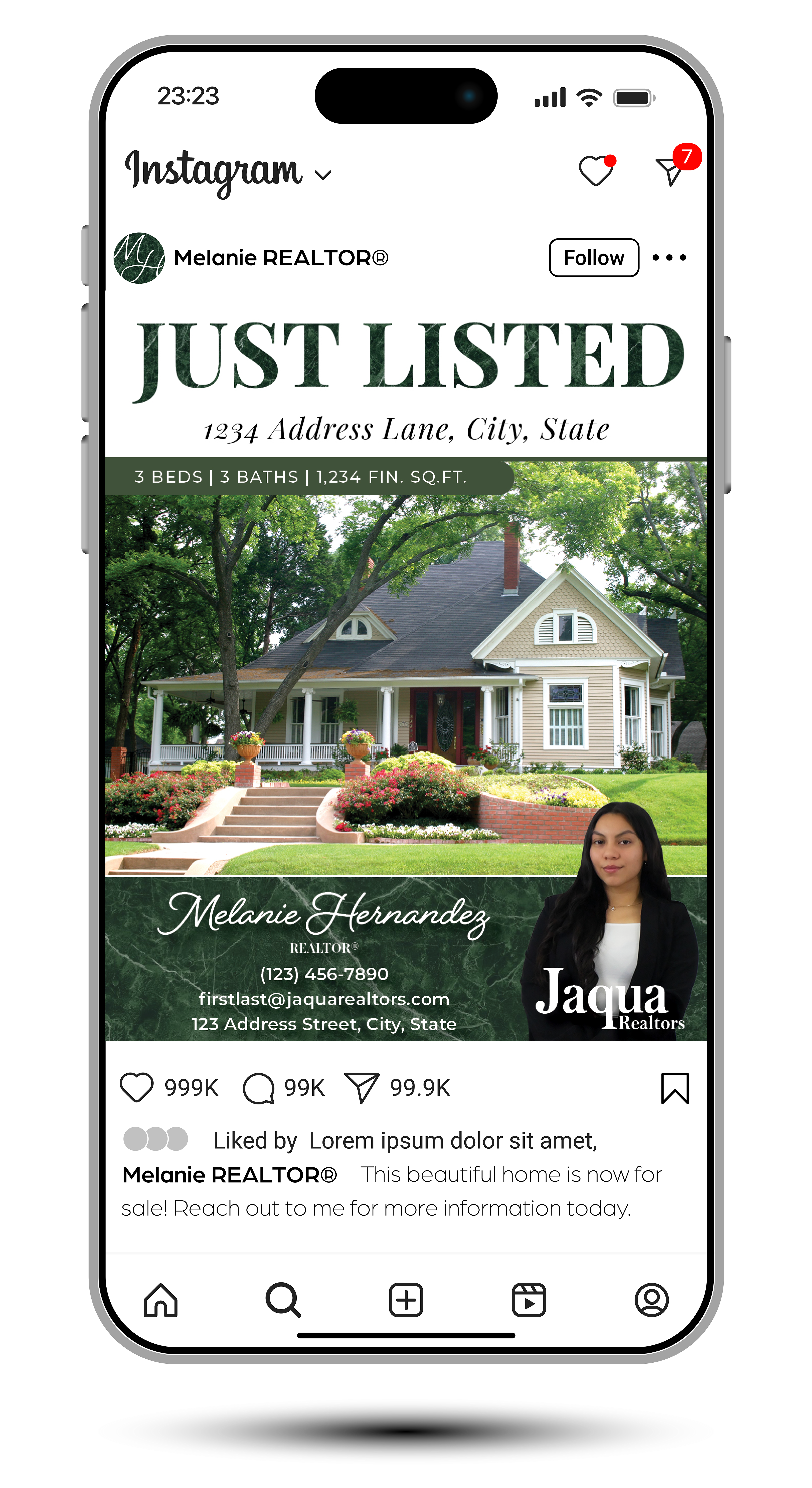
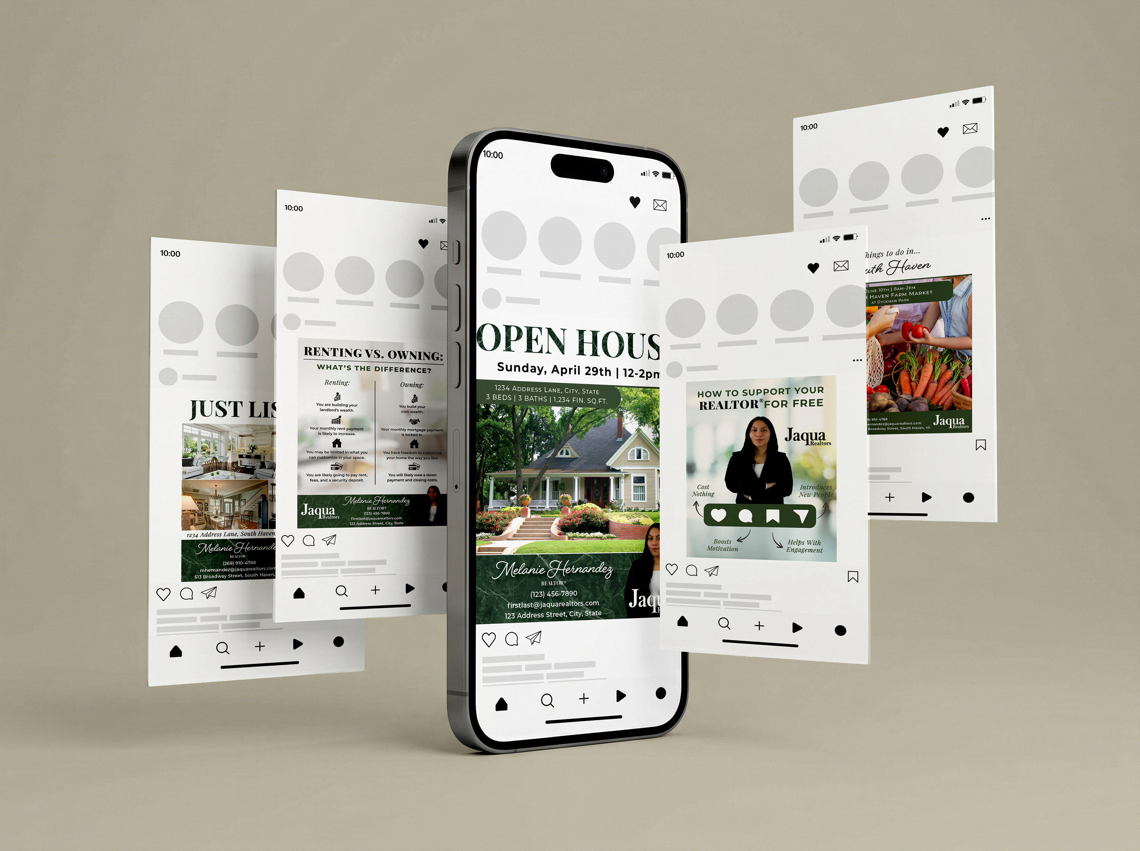
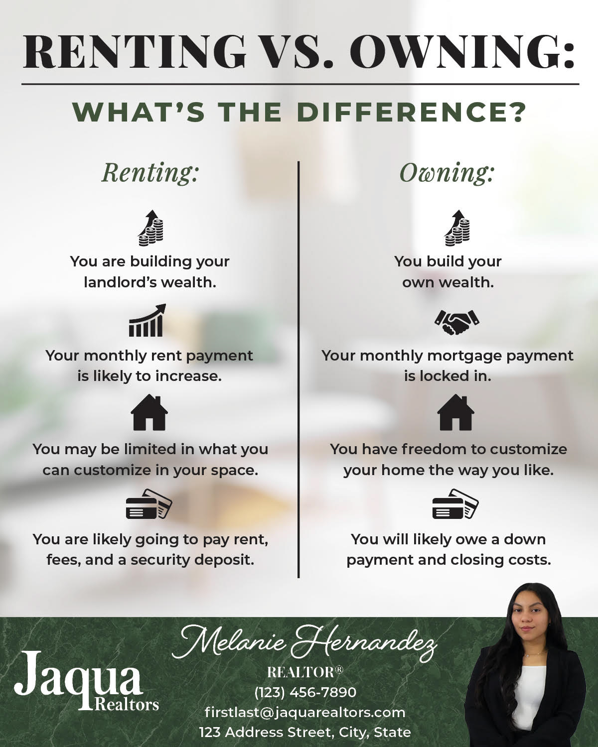
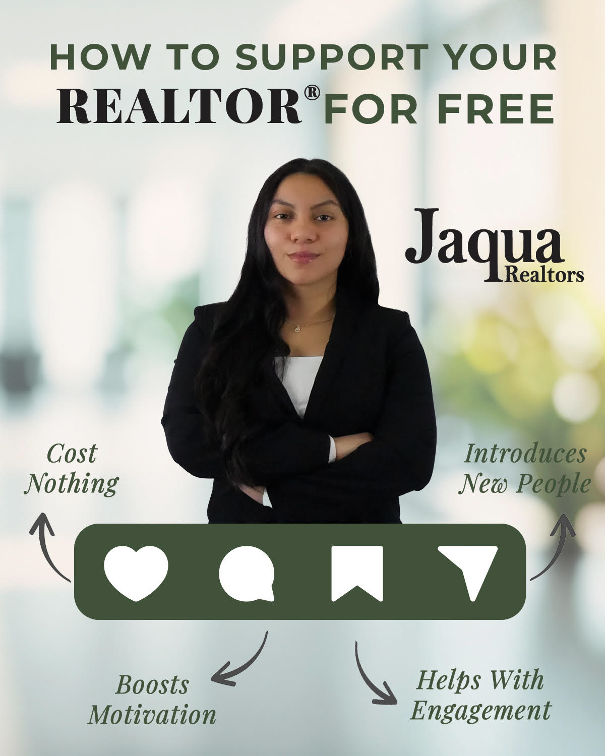
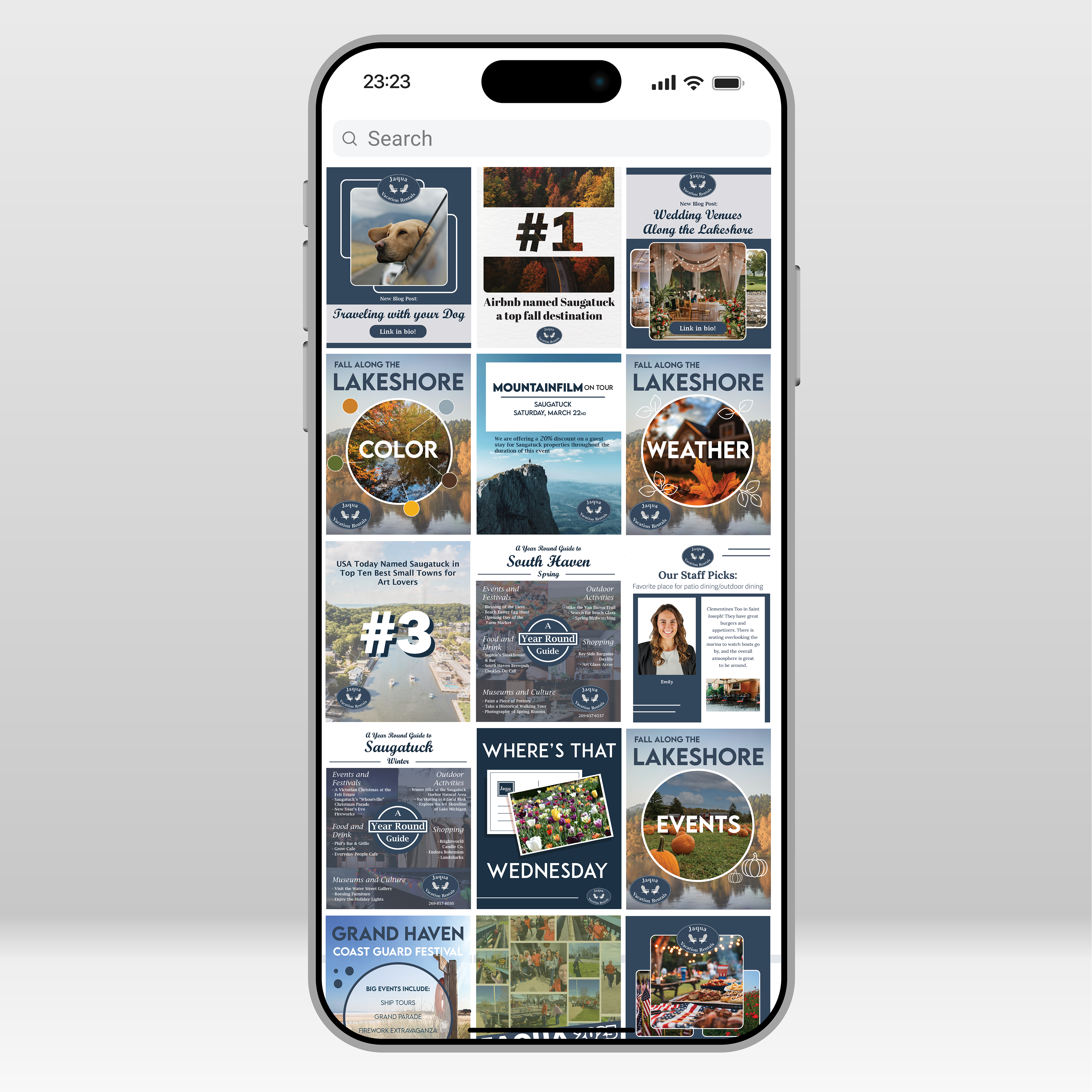
To strengthen brand awareness and maintain a consistent online presence, I create ongoing social media content that aligns with the client's visual identity and marketing goals.
The content includes promotions for open houses, new listings, recently sold properties, real estate tips, market insights, and more.. Each graphic is designed to be visually engaging while reinforcing the client's expertise, increasing audience engagement, and supporting business growth through consistent, recognizable branding.