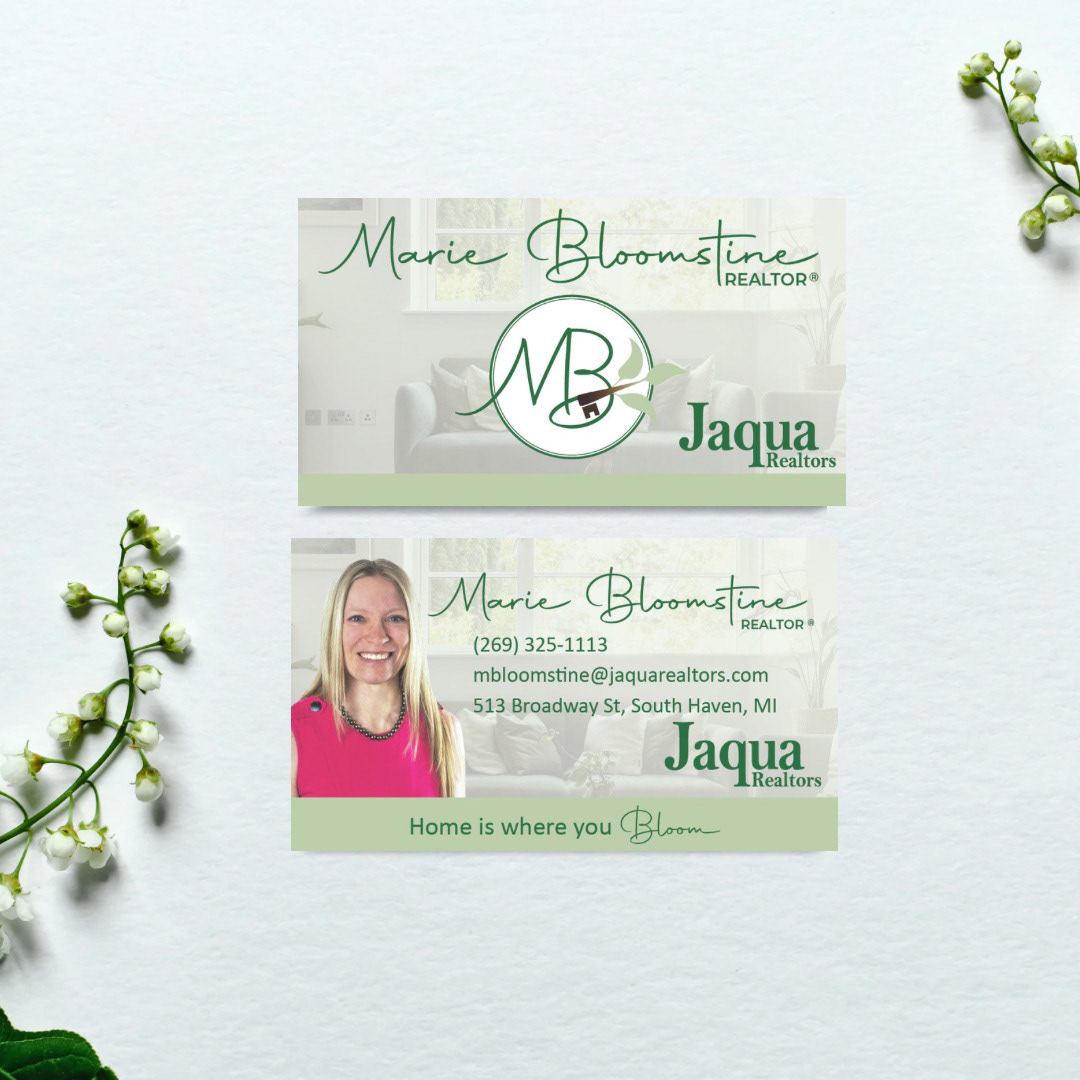
Logo Design
When designing a brand for a real estate agent, the client emphasized on how she wanted to represent herself through her business by showcasing her authenticity, confidence in growth, and building a community.

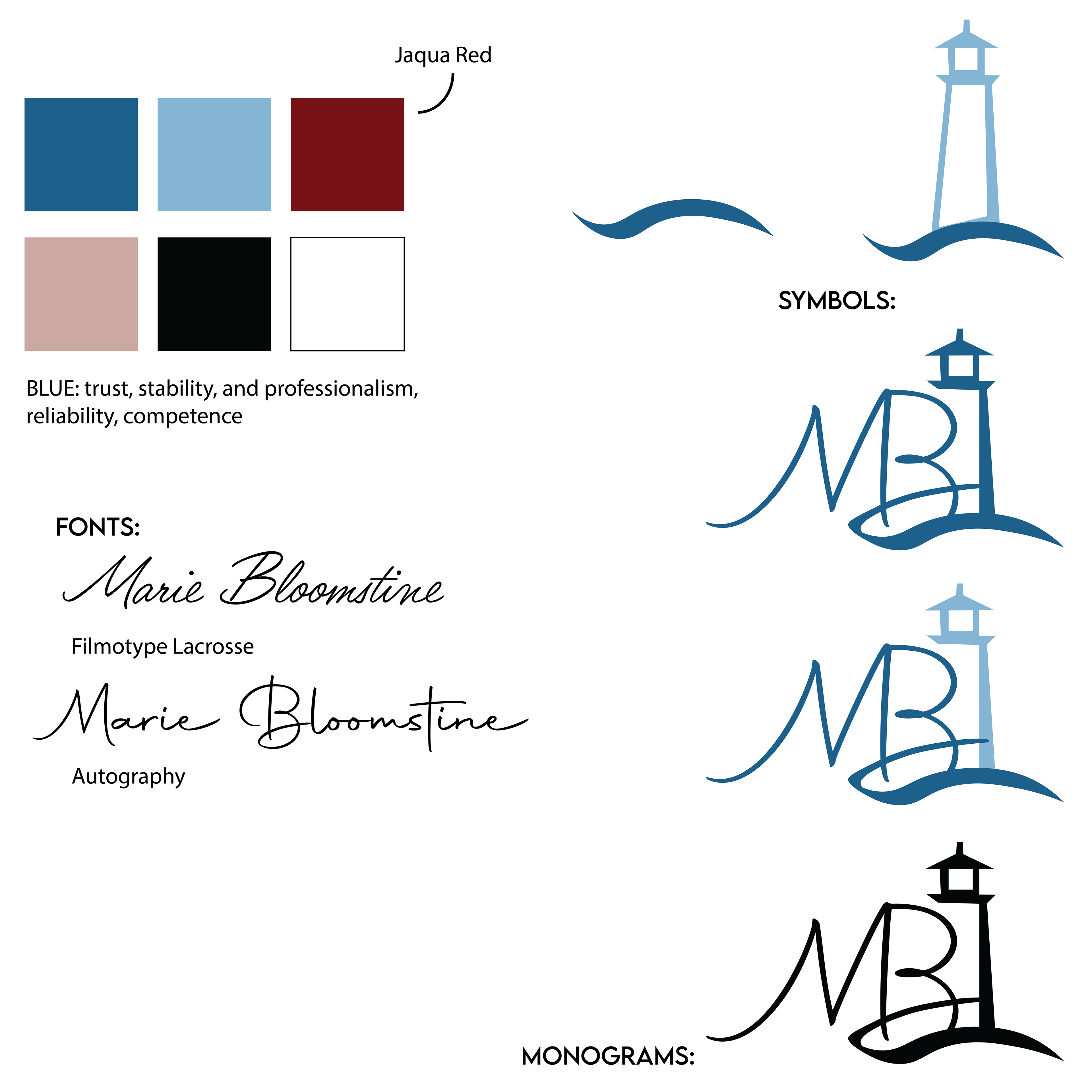
The two logos I guided her toward were designed to reflect both her identity and her commitment to her business. One concept leaned more toward community representation, centered around the iconic South Haven lighthouse. The blue color palette conveyed her confidence in her business, while the lighthouse symbolized her loyalty to the community. At the base, waves were incorporated to mirror Lake Michigan, highlighting both her love for the area and the unique beauty that South Haven offers.
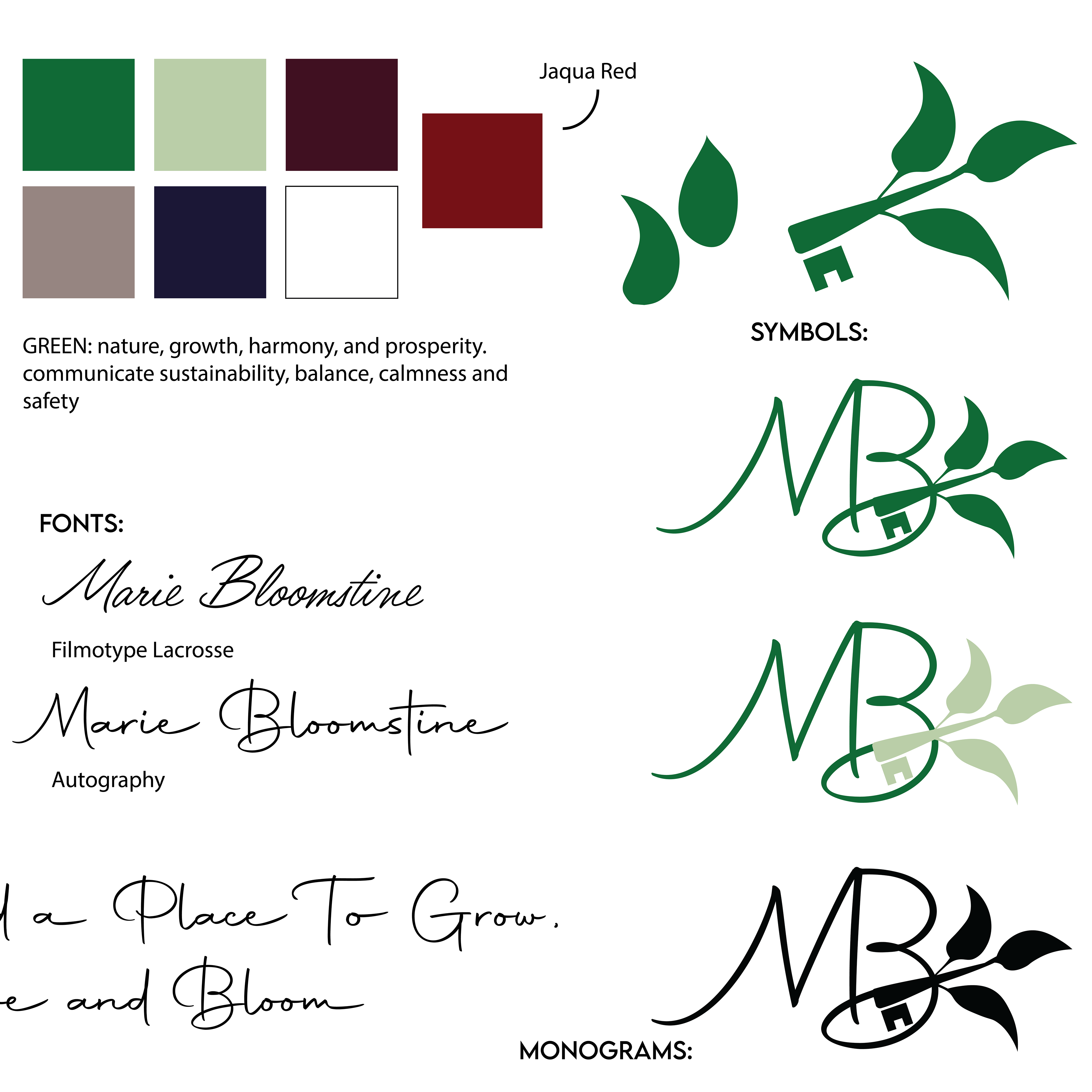
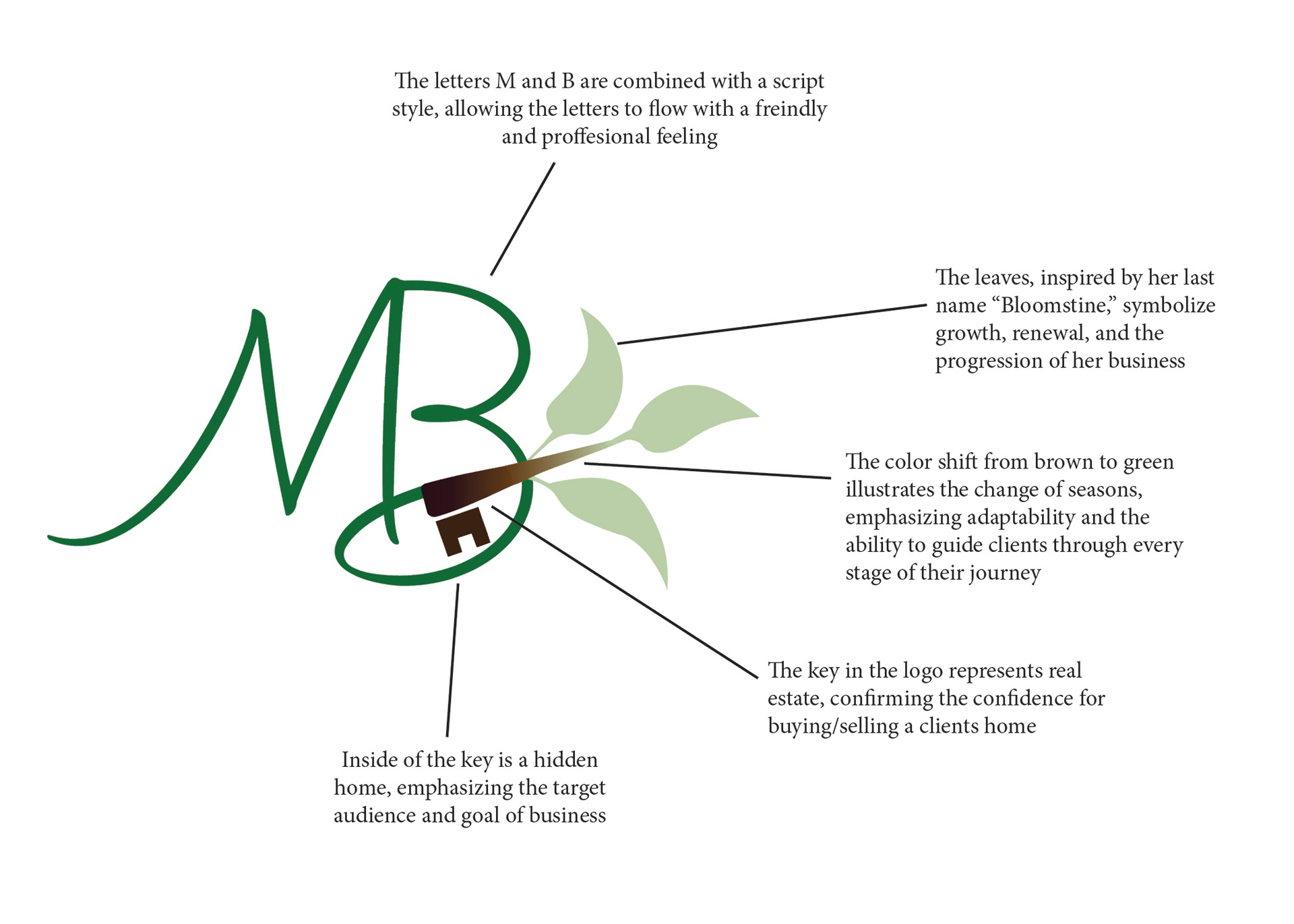
The chosen logo represents both the client and her business as a unified whole. The leaves, inspired by her last name “Bloomstine,” symbolize growth, renewal, and the progression of real estate, while the branch of leaves transitions into a key, seamlessly tying in the real estate focus of the brand. The curves of the lettering convey an authentic and playful energy that reflects her personality. The color shift from brown to green illustrates the change of seasons, emphasizing adaptability and the ability to guide clients through every stage of their journey. Together, the monogram, key, home symbolism, and leaves form a cohesive design that captures both the flourishing growth of the business and the confidence, trust, and sense of new beginnings that clients experience when buying or selling a home.